Your art teacher lied
Guess what? Chemistry isn’t the only high school course built on a foundation of lies. In art class we’re taught that the primary colors are red, yellow, and blue. Not only is it wrong to say that there are three true primary colors, but if we were to pick three, we’d pick a better combination.
Let there be light
A band of wavelengths in the electromagnetic spectrum between 390nm and 700nm makes up the visible spectrum of light; we perceive different wavelengths within this spectrum as colors. White light is a combination of all wavelengths in the visible spectrum.

Humans are trichromats, which means that we have three types of color receptors (cone cells). Our short-, mid-, and long-wavelength sensing cones sense blue, green, and red respectively; this brings us to the first set of important primary colors.
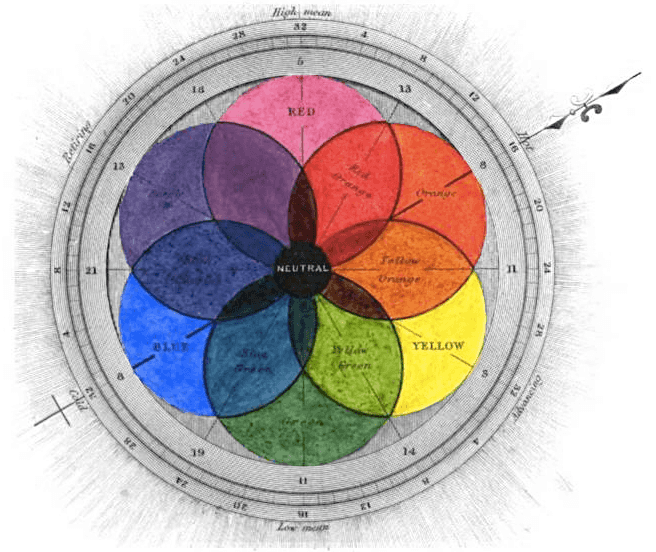
RGB
Also known as the additive colors, Red Green and Blue light can be combined at different intensities to make up a huge range of colors. They’re called “additive” primaries because when they mix together they become brighter, eventually producing white light. If you had three flashlights with these colors you could make almost any color by shining them on a wall together at different brightness levels; most modern display technologies use arrays of RGB pixels to this effect.
Above we see that red and green light mix to form yellow, green and blue mix to cyan, and a combination of all three primaries makes white light. The collection of colors within a color space is called a gamut, and it turns out that the gamut for RGB is awesomely complete. The additive primaries are useful for light sources, but we tend to use another color model when dealing with light reflectors like paint and ink.
CMY(K)
When we perceive a chair as red it’s because the chair is absorbing all wavelengths but red so that only red light reaches our eyes. As we mix more paints together we approach black, since each color absorbs particular wavelengths.

Just as RGB produces a great gamut for light sources, Cyan Magenta and Yellow are great for printed materials. Adding the three together forms black since no light will be reflected from the mixture; that’s why we call this a subtractive color model. Since ink is expensive and making black from scratch wastes a lot of ink, printers usually include separate black ink as well, which is where the K in CMYK comes from2.
Since the early 20th century3 we’ve been using CMYK as our primary subtractive colors. Before then, the standards were red, yellow, and blue; red served as a rough approximation for magenta, blue for cyan. We discovered that CMYK was better, so we evolved. But our art curriculum didn’t.
Why the lie?
When I mentioned Chemistry class above it was an unfair comparison. Chemistry curriculums take you through the seven circles of orbital hell because they provide you with some useful analytical models along the way. It seems a bit evil, but I can buy it.
Your art teacher, though… they lied to you for no good reason! There are only three ways that I can semi-justify the red, yellow, blue thing:
- Teachers are concerned that their students won’t grasp fancy color names like magenta and cyan, and thus stick with the monosyllabic red and blue.
- Teachers are trying to provide historical context from before scientific color theory so that students can better understand classical palettes. In reality, it was very uncommon for painters to mix their colors from the primaries, starting instead with a focused palette and more than three base colors.
- Though I’m still on a hunt for conclusive studies, color-blindness could be a consideration.

Whatever the motivation, teaching RYB as the one-color-space-to-rule-them-all is damaging to future designers. It creates confusion when terms like additive and subtractive spaces are finally taught, and causes debate when blue and red are replaced with cyan and magenta. Worse, it gives red, yellow, and blue god status even though they’re just secondary colors in another space like every other color.
Conclusion
Art teachers are propagating a millenium-old lie that sounds like it could be the beginning of a Dan Brown novel4. Grab your pitchforks, grab your torches… art teachers, we’re coming for ya.
Addendums
2014-03-24
Fellow hacker-schooler Alex Clemmer made a great point that since red-green color-blindness is more common than blue-yellow color-blindness, the RYB space may be more accessible. Though most people with RG color-blindness can still differentiate between cyan and magenta, I’m going to try to scape up some comparative accessibility studies.
Footnotes
-
This would be true for a physical chair, or if you printed this page. If you’re reading this on a screen, it looks red because the red pixels are turned on. Help me out here and imagine it’s a physical chair, ok? ↩
-
Starting in 1906 with the Eagle Printing Ink Company’s four-color wet process. ↩
-
Dan, shoot me an email if you’re interested. I’ve got the first hundred pages ready for printing. ↩